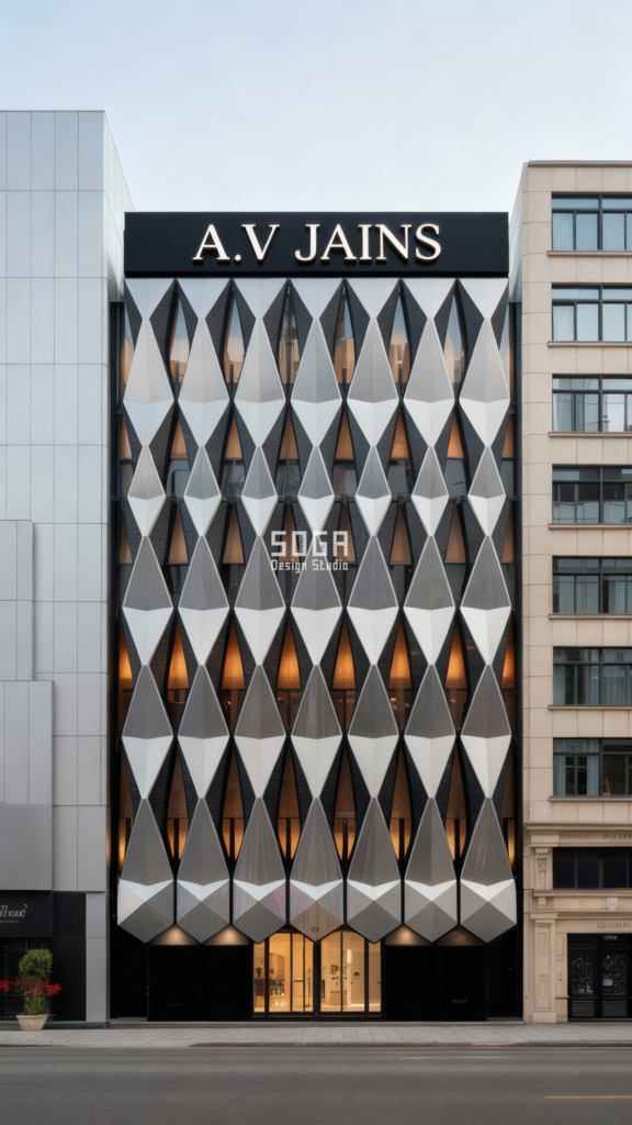
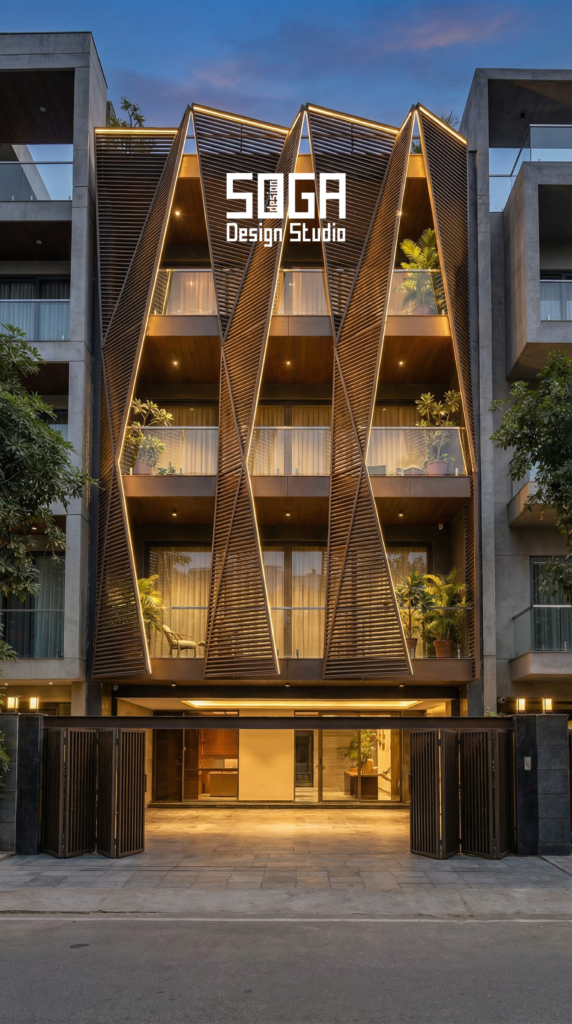
A facade becomes iconic when a stranger can describe it accurately from memory. That is the whole test. Not how much it cost, not how unusual the material was, not how many people photographed it in its first month — whether somebody who walked past once can tell you what it looked like a year later, in a sentence, and be right.
Judged that way, very few Indian facades qualify, and the ones that do are rarely the most expensive. They tend to share five qualities that have almost nothing to do with budget: real depth, one idea repeated, an honest answer to the climate, a material that ages in a way it can survive, and a silhouette that reads before any detail does.
This is an argument about what those five qualities are, why most facades miss them, and a five-question test you can apply to any elevation — including one you are about to commission. We are deliberately not naming other people’s buildings; the design studies shown are SOGA concepts.
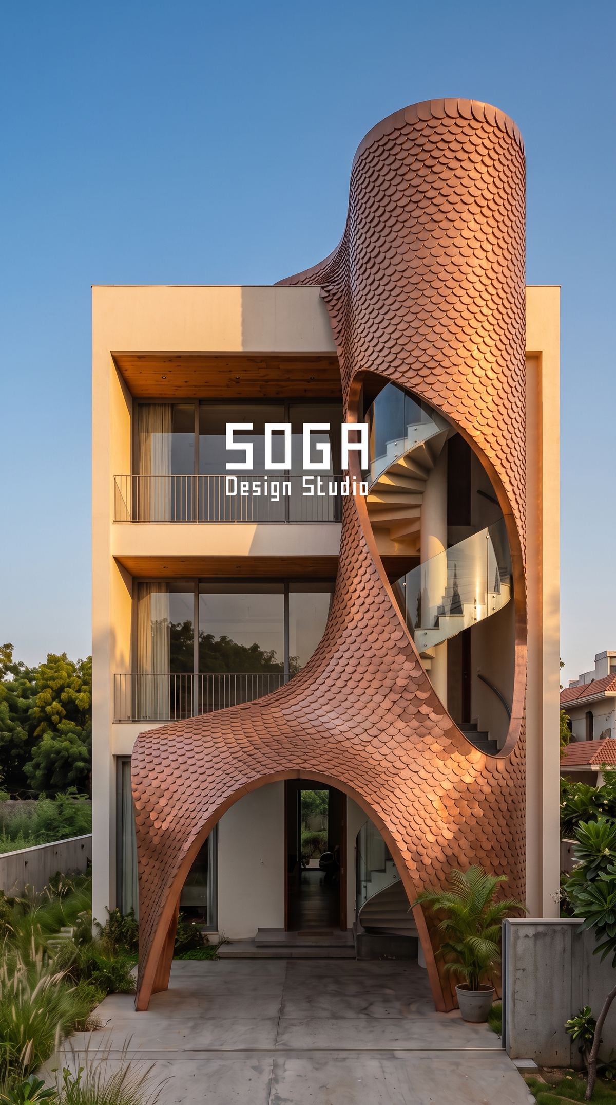
Iconic Is Not The Same As Expensive, Or Unusual
The most common assumption is that a memorable facade is a costly one. The relationship is much weaker than people expect. Cost buys material quality, size and complexity — none of which is the thing the memory holds onto. Memory holds shape and rhythm.
The second assumption is that novelty does it. Novelty is what makes a facade photogenic in its first year and forgettable in its fifth, because an idea whose only quality is that nobody has done it before stops having that quality almost immediately. Buildings that stay interesting are usually doing something simple with unusual conviction.
There is a useful sorting question here. If you removed the colour and the material from a facade — imagined it in plain grey — would anything remain that you could describe? If yes, the form is doing the work and it will last. If no, the facade is a surface treatment, and surface treatments date at the speed of fashion.
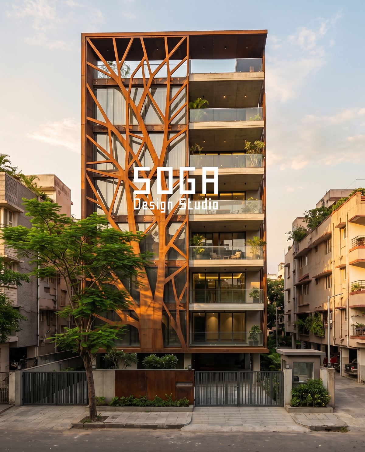
Quality One: Depth, Because Shadow Is The Real Material
At fifty metres you cannot see texture, finish or joint detail. You can see light and dark. Everything memorable about a facade at that distance is shadow, and shadow needs depth to exist.
This is the single biggest difference between facades that photograph well and facades that work in life. A printed or flat-patterned surface looks rich in a rendering, where the software adds contrast that the sun will not, and then reads as a grey smudge from across a road. A facade with 200 to 400 mm of real depth produces shadows that change through the day, and a building that changes through the day is one people remember.
| Depth of the facade element | What it does at street distance |
|---|---|
| Flat surface, pattern printed or applied | Reads as a single tone; effectively invisible at 30 m |
| Up to about 50 mm | A faint line; disappears under overcast sky |
| 100–200 mm | Legible shadow that moves through the day |
| 200–400 mm | Strong modelling; the facade reads as form, not surface |
| Over 400 mm | Reads as architecture rather than cladding; costs more to hold up |
Depth is also where budgets get quietly cut, because it is invisible on a drawing that is judged as a picture. A fin reduced from 300 mm to 100 mm saves material and looks almost identical on a render. On the building it is the difference between a facade with a shadow and a facade without one.
This is why the honest way to protect a design is to write the reason for a dimension next to the dimension. A fin depth with the note “sets the shadow at 3pm in May” survives value engineering. A fin depth on its own does not.
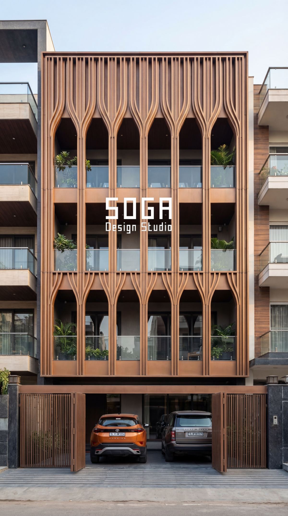
Quality Two: One Idea, Repeated Enough To Read As A Rule
Memorable facades are almost always doing one thing. Not five interesting things — one thing, carried far enough that the eye works out the rule and enjoys watching it play out.
A module that repeats twenty times becomes a rhythm. The same module used three times, next to two other ideas, becomes visual noise. This is the most common failure in Indian residential facades: an elevation carrying a stone band, a fin screen, a jaali panel and a feature column, each individually reasonable, collectively cancelling one another out.
The test is whether a viewer could predict the next bay. If they can, the facade has a rule. If every bay is a surprise, there is no rule to remember — and nothing to remember means nothing to describe later.
- One operation, many times. A fold, a rotation, a taper, a lap — applied consistently across the frontage.
- One variable that changes. The rule is more interesting if a single parameter shifts across the building — depth, spacing, angle — while everything else holds constant.
- Few part numbers. Repetition is not only a visual virtue; it is what makes a facade affordable and buildable.
- A closing condition that is designed. Where the rule stops — at a corner, under the parapet — is where a considered facade separates from an improvised one.
That third point matters commercially. The facades that read as most deliberate are frequently the cheapest per square foot to fabricate, because everything repeats. Coherence and economy point the same direction here, which is not true of most design decisions.
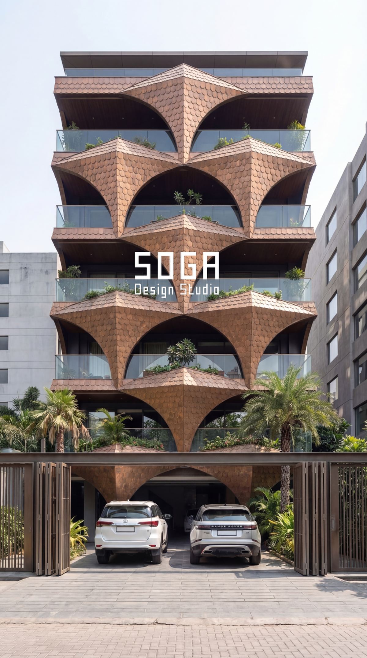
Quality Three: It Answers The Climate It Stands In
A facade that could be anywhere is rarely memorable anywhere. The elevations that feel like they belong are the ones whose form comes from a job the local climate gave them.
In India that job is almost always sun. A deep west screen, a horizontal band sized to the summer sun, a recessed opening with a shadow you can stand in — these produce form as a by-product of function, and form arrived at that way tends to look inevitable rather than styled. It is also the reason so much older Indian architecture still reads well: the deep verandah and the shaded court were solving heat, and the solving is what produced the character.
| Climate job | Form it tends to produce |
|---|---|
| Blocking low western sun | Deep vertical fins or a standing screen with strong shadow |
| Blocking high summer sun on the south | Horizontal bands, projecting slabs, brise-soleil |
| Shedding monsoon water cleanly | Pronounced drips, overhangs and sloped ledges |
| Keeping a wall cool | A ventilated cavity, and a skin standing off the wall |
| Letting north light in | Openness and fineness on the coolest elevation |
The reverse is also worth stating plainly: a facade whose form answers nothing tends to need decoration to stay interesting, and decoration is precisely the layer that dates. When people say a building looks timeless, they usually mean its shape had a reason.
There is a measurable side to this too — external shading materially reduces cooling load, which is worked through with numbers in does a facade reduce your AC bill.
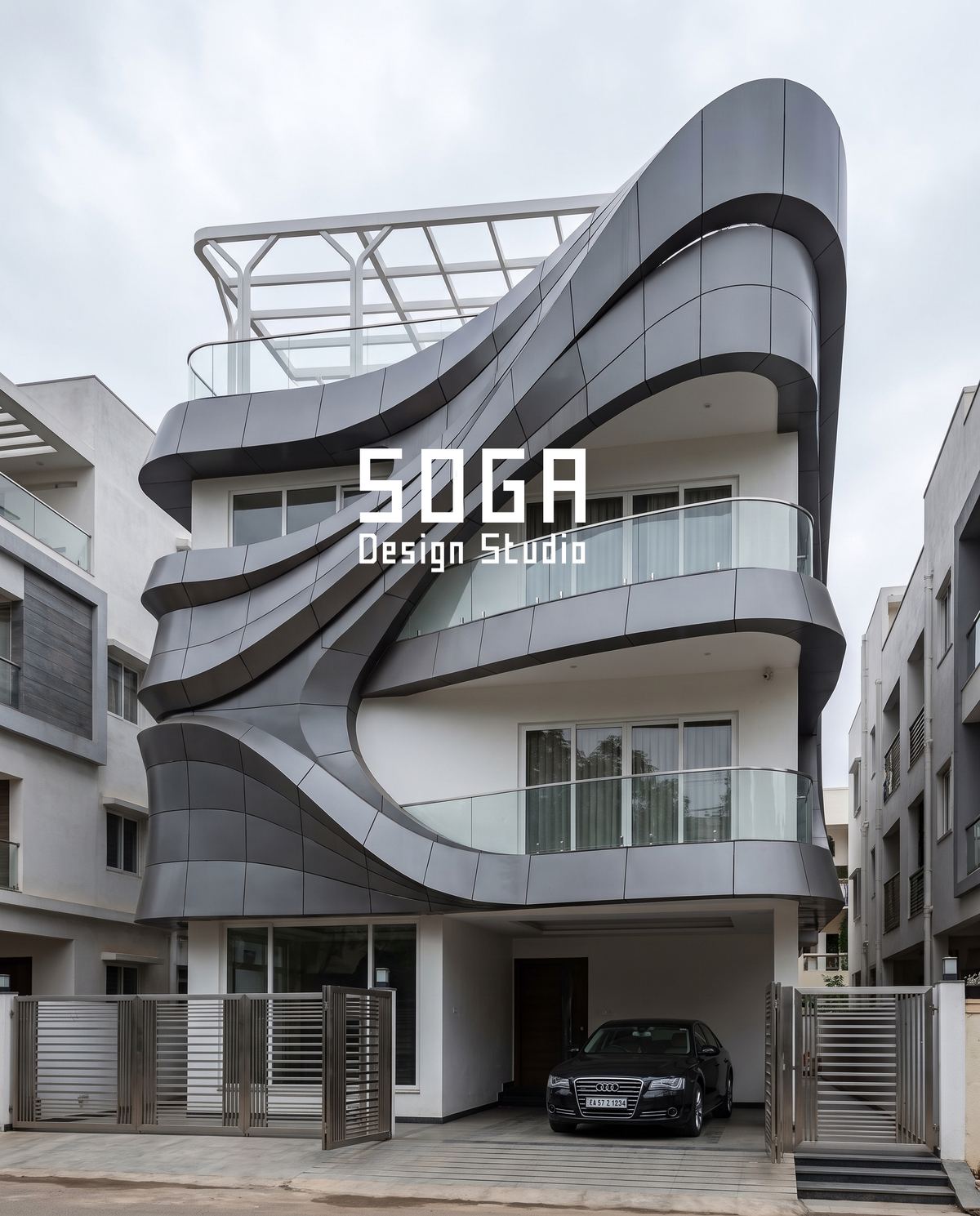
Quality Four: Material Honesty, And How It Ages
Iconic facades are generally made of what they appear to be made of. Materials pretending to be other materials — a print imitating stone, a laminate imitating timber — work at a distance and fail on approach, and the failure is what people remember.
Ageing is the harsher filter. A facade is judged in year ten far more often than in year one, and by then the question is not what it looked like new but whether it has aged into something or out of something.
| Ages into character | Ages into a problem |
|---|---|
| Weathering steel, copper, brass — they patinate by design | Bright coatings on strong colours, which fade unevenly |
| Through-body terracotta and clay — colour is in the body | Printed or surface-coloured panels that scratch to a different colour |
| Stone and exposed concrete, if detailed to shed water | Any flat ledge that streaks below every horizontal |
| Timber, if allowed to grey deliberately | Timber expected to stay the colour it arrived |
The right-hand column is not a list of bad materials. It is a list of materials whose ageing has to be planned for rather than hoped away. A colour that will fade can be specified in a grade that fades slowly and evenly, which is a different conversation from pretending it will not fade — set out in anodising vs powder coating vs PVDF.
The detail that decides more of this than the material choice is water. Almost every Indian facade that looks tired is streaked, and streaking is a drainage failure rather than a material failure — a ledge without a fall, a sill without a drip. Get the water off the face and most materials age acceptably.
Quality Five: A Silhouette You Can Recognise From Distance
The last quality is the one most often skipped in India, because it belongs to the massing rather than the skin, and by the time a facade designer is appointed the massing is usually fixed.
A silhouette is what you would draw if you had to describe the building in five seconds. It lives in the outline — the top edge, the corner, where the building meets the ground. Facades that stay in the memory usually have at least one of those three doing something deliberate.
On a narrow Indian plot, where the massing is set by bye-laws and there is very little freedom in the outline, the silhouette has to be manufactured within the skin instead: a parapet treated as a distinct edge, a corner turned rather than stopped, a base band that anchors the building visibly to the ground. These are small moves and they are disproportionately what makes an elevation look finished.
- The top. A facade that simply stops below a coping looks unfinished; one that resolves at the parapet reads as designed.
- The corner. Whether the idea turns the corner or dies at it is the single fastest way to tell a considered facade from a decorated frontage.
- The base. The bottom 900 mm takes all the abuse and most of the attention at walking speed.
- The entrance. Not necessarily central, but unmistakable — the one place the rule is allowed to break.
Those four are also, conveniently, the four places a facade is most likely to fail technically. A designer paying attention to the top, corner, base and entrance is solving appearance and durability with the same drawings.
The Five-Question Test
Apply this to any facade — one you admire, or one you are being sold. It takes about a minute and it is surprisingly decisive.
| Question | What a yes means |
|---|---|
| Imagine it in plain grey. Is anything left to describe? | The form is doing the work, not the finish |
| Can you predict what the next bay looks like? | There is a rule, and rules are memorable |
| Does any part of the shape have a job? | Form has a reason, which is what reads as timeless |
| Will the material look intentional in ten years? | It ages into character rather than out of it |
| Could you sketch its outline from memory? | It has a silhouette, not just a surface |
Most facades score one or two. Three is good. Four or five is rare, and almost always belongs to a building somebody thought about for longer than the programme allowed.
The test is also useful in the other direction. If a design you are being shown fails question one — nothing remains in plain grey — then what you are buying is a finish, and finishes are the part of a facade most vulnerable to budget cuts, fading and fashion.
What Does Not Make A Facade Iconic
Worth stating directly, because these are the things most often sold as the route to a landmark building.
- Size. A large forgettable facade is simply forgettable at a larger scale. Some of the most memorable frontages in Indian cities are on narrow plots.
- An imported material. Where a material came from is invisible to everyone except the person who paid for it.
- Complexity. More elements is not more interesting. It is usually less, because it removes the rule the eye was following.
- Copying a striking reference image. A form lifted from another climate, another plot and another structure usually arrives diluted — and it will be recognised as borrowed by exactly the people you hoped to impress.
- Lighting used as rescue. Good lighting makes a good facade better after dark. It cannot give a flat facade a shape it does not have, and a strongly lit flat facade is flat and bright.
- Novelty for its own sake. An idea whose only merit is unfamiliarity has a short life by definition.
The pattern across all six: each is a way of spending money on the facade without changing its form. Form is the part that persists, and it is usually the cheapest part to get right — it is decided by drawing, not by purchase.
How SOGA Design Studio Works Toward These Qualities
We design facades for plotted houses and small commercial buildings across India, and this is the checklist our own work is held against rather than a description of results.
In practice it shapes the process in five specific ways:
- The concept is tested in grey first. If it does not hold without colour and material, it is not finished.
- One operation per facade. A single geometric move, carried across the frontage, with one parameter varying — not a collection of features.
- Depth is specified with its reason, so the dimension that produces the shadow survives the budget conversation.
- The sun path comes before the pattern. Which elevation takes the heat decides the geometry; the aesthetic follows from it.
- Top, corner, base and entrance are drawn as details, at 1:5, because that is where a facade is judged and where it fails.
None of that guarantees a memorable building — plenty of careful facades are merely competent, and that is an honest thing to say. What it does is remove the common reasons a facade turns out forgettable, which is a more achievable goal and a more useful promise.
For the wider context of how this way of designing developed, see parametric architecture in India 2026.
The Honest Limit
Iconic is not a property a designer can confer, and any studio claiming it can is overselling.
A facade becomes memorable partly because of where it stands, who walks past it, what surrounds it and how long it survives unchanged. A considered elevation on a quiet lane may be seen by four hundred people a year; an ordinary one on an arterial road is seen by four hundred thousand. Prominence is not a design quality, and a great deal of what gets called iconic is really well-designed plus well-located.
The second limit is time. Nobody can judge this from a render, or from year one. The qualities on this page are the ones that historically tend to survive — depth, rule, reason, honest ageing, silhouette — but they are a way of improving the odds, not a formula. The honest ambition for most projects is not to build a landmark. It is to build something that still looks deliberate in fifteen years, which is achievable, unglamorous, and very much rarer than it should be.
Frequently Asked Questions
What actually makes a facade iconic?
Five qualities, none of which is cost: real depth so the facade has shadow at distance; one idea repeated enough that the eye can predict the next bay; a form whose shape answers the climate it stands in; a material that ages into character rather than out of it; and a silhouette recognisable from a distance. The practical test is whether a stranger could describe it accurately from memory a year later.
Does an iconic facade have to be expensive?
No, and the link is weaker than most people assume. Cost buys material quality, size and complexity, while memory holds shape and rhythm. Repetition — which is the second quality — usually makes a facade cheaper to fabricate, not dearer, because everything repeats and the part-number count stays low. Some of the most memorable frontages in Indian cities are on narrow plots.
How much depth does a facade need to read from the street?
Roughly 200 to 400 mm of real depth gives strong modelling that reads as form rather than surface. Between 100 and 200 mm gives legible shadow that moves through the day. Below about 50 mm the effect disappears under an overcast sky, and a flat printed pattern reads as a single tone from 30 metres. Depth is also the first thing cut in value engineering, because it looks nearly identical on a render.
Can lighting make an ordinary facade iconic?
No. Good lighting makes a facade with form look better after dark, because it has shadows to work with. On a flat facade it produces a flat, bright surface. Lighting is an amplifier of shape rather than a substitute for it, which is why the lighting strategy should follow the geometry rather than rescue it.
Is copying a facade from a reference image a bad idea?
Usually, yes. A form lifted from another climate, plot and structure arrives diluted, because the things that made it work — the sun it was answering, the frame it hung on, the distance it was seen from — do not travel with the picture. It also tends to be recognised as borrowed by precisely the audience it was meant to impress. Reference images are far more useful for identifying which quality you are drawn to than for copying.
Related Reading
- Parametric architecture in India 2026 — the future of facade design
- Parametric facade design in India — the pillar guide
- Does a facade reduce your AC bill? The real numbers
- Anodising vs powder coating vs PVDF: which finish lasts in India
- Parametric facade maintenance in India: the 20-year reality
- Vertical fins vs horizontal louvres for an Indian house
Design For The Version Of The Building That Lasts
SOGA Design Studio tests every facade concept in plain grey before colour or material is chosen, carries one geometric operation across the frontage, and draws the top, corner, base and entrance as details. Talk to us about your building.