Slats and fins look simple until you have to pick one for a real Indian street. The same idea of a row of vertical blades can screen a showroom, quieten a narrow house, glow like a lantern at night or sit quietly on a gate. These slat and fin facade ideas India owners keep asking about differ far less in style than in what they demand from the plot, the sun and the person who cleans them.
This post walks through four studio concepts from one design study: a furniture showroom under three lens-shaped timber-tone louvre panels, a graphite slat wave on a narrow house, a stilt-plus-four apartment with cream wave bands, and a night view of a fin veil cut by pointed notches. Each section says what is drawn, how it would be built, where it fails first and what to ask a fabricator. The comparison table and the decision questions near the end let you weigh them side by side.
All four are studio visualisations, not built projects. Dimensions are design intent for the concept, offered so you can test the idea against your own plot.
These are concept designs by SOGA Design Studio, produced as design visualisations rather than photographs of completed buildings.

Lens-shaped slat panels for a showroom frontage
The lead image above shows the most commercial of the four. A double-height glass front, lit warm from inside, carries the product. Above it, three lens-shaped panels of closely spaced vertical timber-tone slats are stacked on an off-white stone-clad wall, each one overlapping the next in a slightly different phase. The glazing stays completely clear; the screening lives above it, over the upper floors, where the windows behind show through the gaps.
That split is the whole logic. A shopper standing 8 m from the kerb must be able to read the lowest item on the display shelf, so nothing crosses the ground and mezzanine glass. The lens panels do the job a hoarding does on a busier street: they turn the top of a plain box into a recognisable shape, and the lowest lens gives the gold lettering a continuous timber-tone backing. The name on the render is invented and would be replaced by the tenant’s own.
For the concept we assume a slat about 45 mm wide and 70 mm deep at 110 to 120 mm centres, held on a hidden rail roughly 150 mm off the wall so air and light move behind. Every slat inside a lens has its own length, so the count of unique parts is the cost driver. Step the lengths in 25 mm increments rather than following a perfect curve and the fabricator cuts far fewer variations. Fix the lettering on a solid panel inside the lens, never onto slats, where the gaps would slice every letter into strips.
Dust is the recurring problem on a road-facing frontage. A tight pitch looks rich for a year, then holds a grey film. Leave a walkable roof edge above and a gap behind each panel wide enough for a soft brush, and close the top edge of each lens with a sloped cap so monsoon water does not sit on it.
A graphite slat wave on a narrow infill house
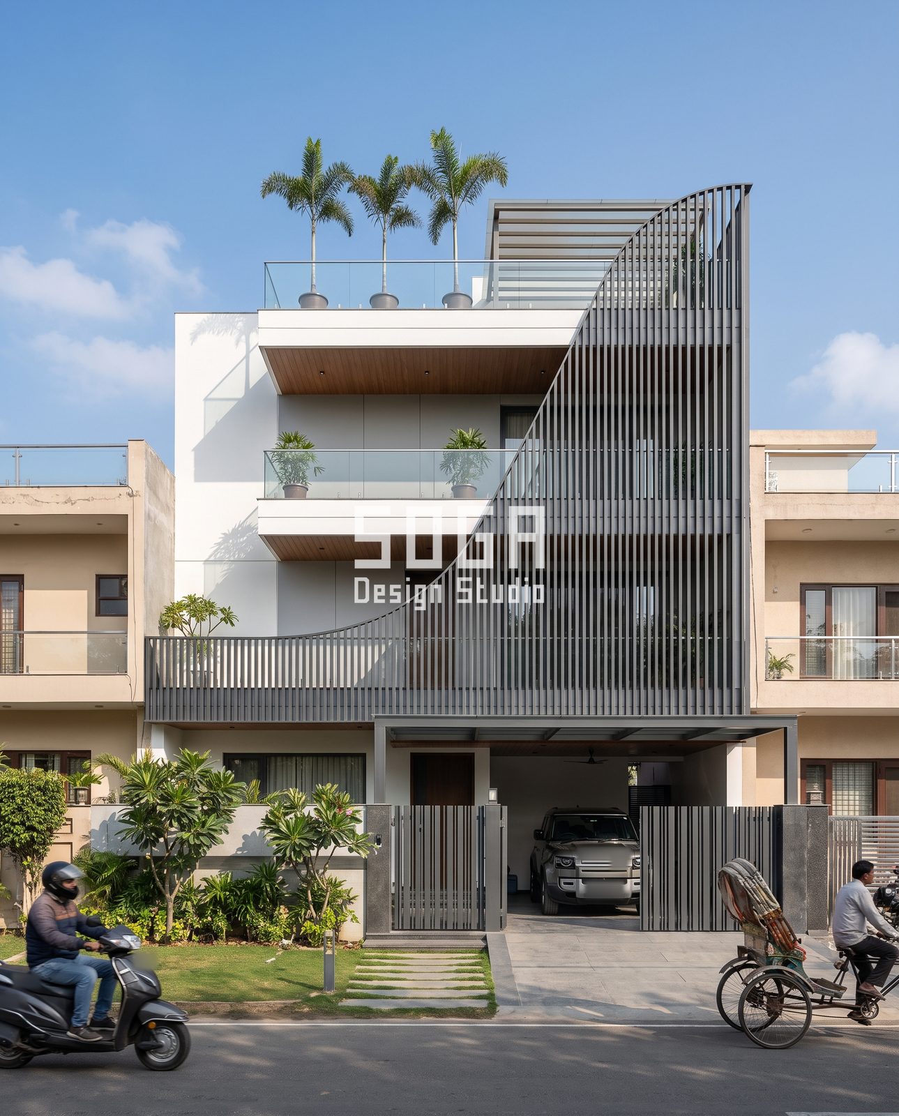
On a 7 to 9 m frontage between two neighbours, restraint is a practical strategy. This concept uses three finishes only: white matte render, graphite powder-coat-tone slats and gates, and timber-tone soffits under the cantilevers. The single gesture is an S-curve of vertical slats, low at the left where they screen the first floor and rising to one tall blade that stands above the roof terrace beside a row of palms.
The design intent is a slender slat around 40 mm wide and 90 mm deep on a 130 mm pitch, about forty across the screened width, each cut to follow the curve. Graphite hides dust and monsoon streaks better than white, and the white field gives it something clean to read against. The one warm note is the timber-tone soffit. Add a fourth colour and the discipline is gone without any gain.
Two engineering points matter here. First, a tall blade above a terrace has to be braced back to the slab: the concept uses a concealed steel section behind the tallest slats tied into the terrace edge, so the slats carry no structural load. Second, dark metal-look finishes get hot. In May sun the surface of a graphite slat can reach 65 to 70 degrees Celsius, so keep a ventilated gap of 25 to 40 mm between slat and balcony rail and choose charcoal rather than black.
The slab lines, parapet height and gate height also follow the cream houses on either side, within a few hundred millimetres. A quiet facade that ignores its neighbours’ datum lines reads as a foreign object however neat the detail. Give every service a place before the layout is fixed: condensers behind the screened side in a louvre panel of the same graphite tone, downpipes on the party-wall face. For a wider look at vertical against horizontal blades on a house, see the comparison linked below.
Cream wave bands as a solid alternative to slats
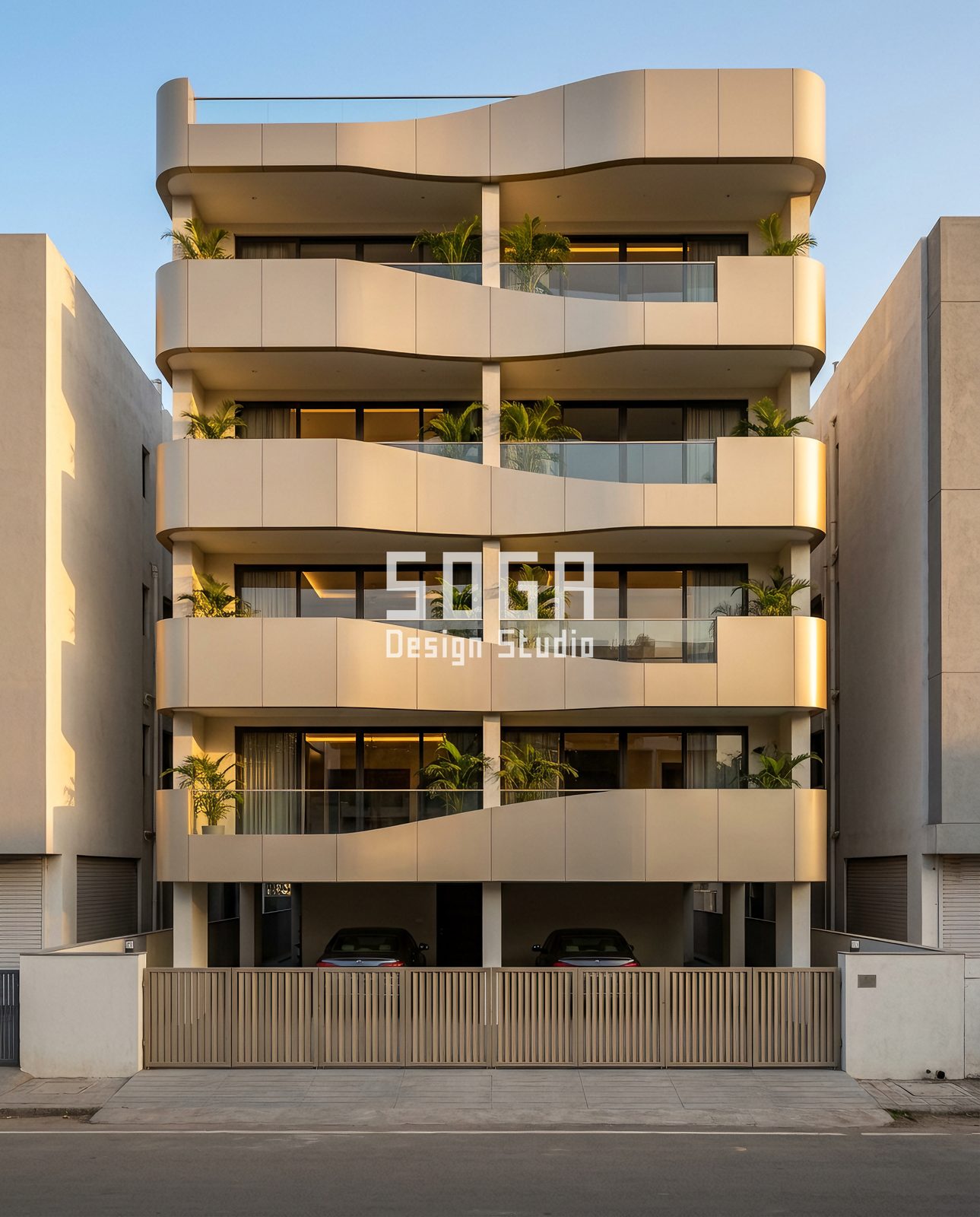
This one is honest about being the outlier. The apartment block above uses no slats on the facade at all: four full-width balcony bands faced in cream panels with vertical joints, each band a gentle wave with crests and troughs alternating left and right and fully rounded ends, over a stilt parking level. Its only slat element is the pale timber-tone gate across the ground floor. It earns a place in a slat and fin study because it shows what you give up, and gain, by choosing a solid band.
A solid band cuts far more sun than any slat, gives a calm continuous surface, and hides air-conditioner shelves and drying racks behind a 300 to 450 mm upstand. What it does not do is filter light or glow after dark, and it shuts out some daylight to the rooms behind. In an apartment the sensible use is on balconies and services, while the slat idea moves to the gate, where a half-open pitch lets a car sit half visible behind it.
Practical points for this idea: vertical joints at about 1.2 m keep panels light enough to install from a cradle, and placing them at each crest and trough makes the joints read as rhythm rather than random cuts. A drip edge under each band and a slight fall on the top surface keep water streaks off cream, which shows them more than white does. Keep the narrowest clear width of any balcony at about 1.0 m or more, or the wave looks better than it lives. A full walk-through of usable area is in the curved-balcony article linked below.
Lit fin veil with pointed notches: the night-time sign
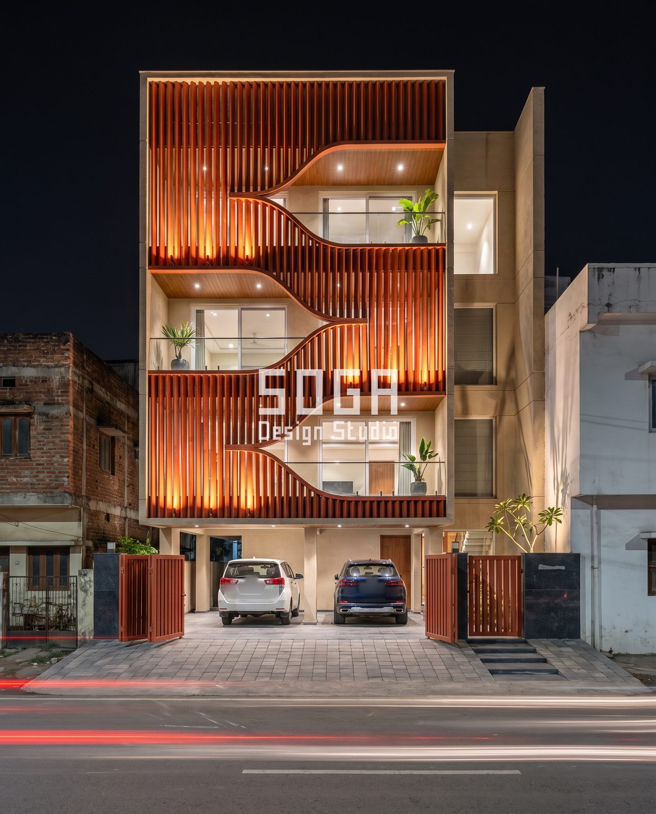
This image is easy to misread as a retail chevron canopy, but it is not a shop. It is a four-storey residential building over a parking ground floor, its street face covered by a tall veil of terracotta-tone vertical fins with three pointed notches cut into it, one per balcony level. The notches alternate left and right, so the veil steps across the front like a staircase, and warm downlights inside each timber-tone soffit turn the fins orange after dark. The same geometry would work on a shopfront, which is why it belongs in this study.
A pointed edge is read before any lettering. A notch that ends in a tongue at 30 to 45 degrees behaves like an arrow, and at night the lit gradient does the work of a sign. Design intent is a blade about 45 mm wide by 180 mm deep at 120 mm centres, wide enough to look solid from the front and open from an angle. The notch is roughly 3.5 m wide and rises about 1.2 m from the balcony edge to the tip, sized so each cut reads from across the road.
The build sequence in the concept: a steel frame carried off the slab edges, with a top and bottom rail tied back with concealed brackets; a bent-sheet or laminated timber-tone soffit under each notch; slats dropped into the rails from above, each cut to follow the notch curve; a concealed clip-rail behind so no fixings show on the face; and a warm LED line in the bottom rail aimed upward, placed 100 to 150 mm behind the slat face so light rakes across the blades and the source stays hidden. Keep the colour temperature near 2700 K, or the terracotta tone turns grey-brown.
Sharp tongues fail first. A pointed edge with a thin rail flutters in wind, so it needs a stiffened edge or bent rib and its cantilever should be checked in the wind load report. The flat soffit under each notch holds monsoon water without a fall of about 1 in 50 to a drip edge, and the closed cavity behind slats invites wasps and pigeons, so cap it with fine mesh and a sloped top.
Slat pitch, depth and gap: the numbers behind the four concepts
The four concepts sit at different points on two dials: how deep the blade is and how tight the pitch is. Reading them together explains why they feel so different from the street.
- Showroom lens panels: about 45 by 70 mm slats at 110 to 120 mm centres, a dense surface with the windows behind just visible.
- Graphite house wave: about 40 by 90 mm slats on a 130 mm pitch, the lightest and most even screen of the set.
- Cream wave bands: no slats on the wall; solid panels about 1.2 m wide, with a slatted gate as the only fine-grained element.
- Lit fin veil: about 45 by 180 mm blades at 120 mm centres, the deepest and the most sculptural, since depth is what catches the light.
A useful rule when you adapt any of these: a slat that is deeper than twice its clear gap reads as a wall from the front, so keep the gap near the blade depth if you want to see through. Halve the gap and the screen turns opaque at an angle and dims the rooms behind.
The four slat and fin ideas compared
| Idea | Does best | Fails first | Check before approval |
|---|---|---|---|
| Lens-shaped slat panels (showroom) | Turns a plain upper wall into a landmark; clear sign backing; clear glass below | Many unique slat lengths; dust in a tight pitch | Mock-up of one lens at kerb distance; access line for cleaning |
| Graphite slat wave (narrow house) | Quiet, one gesture, hides dust; suits infill plots | Heat on dark slats; tall blade needs bracing | Slat-to-rail air gap; service positions before layout |
| Cream wave bands (apartment) | Best sun cut; hides AC and drying racks; repeatable panels | No glow or filtering; darker rooms behind; streaking on cream | Narrowest balcony width; drip edge; joint layout |
| Lit fin veil with notches | Strong night presence; deep shadow line; arrow cue | Every blade different; tongue flutter; water in soffit | Wind check on tongue; LED access; mesh on cavity |
How to choose between them
Five questions settle most decisions. Answer them in order and the shortlist usually drops to one.
- Does the building need to be noticed from a distance, or to blend in? A shop wants the lens panels or the lit veil; an infill house usually wants the graphite wave.
- Who cleans it, and how? If there is no rope point, no walkable edge and no water source, drop the tight pitch and the deep blade.
- Which way does it face? West sun on a dark, closely pitched slat gives the most shade and the most heat; a north face can carry a wider pitch and a lighter finish.
- Are rooms behind it habitable? Slats let daylight through; solid bands do not. Solid works for services and lobbies, slats for bedrooms and offices.
- How many unique parts will you accept? A repeating module priced by the metre is cheaper than a curve where every slat is cut to a different length.
Mistakes that show up first in a slat facade review
- Carrying slats down over the ground-floor display glass, so the shop hides its own product.
- Fixing lettering straight onto slats instead of a continuous panel.
- Choosing a tight pitch for looks, then finding there is no way to clean it.
- Drawing a perfect curve so every slat becomes a different length, with no rationalisation.
- Putting screen and sign on one lighting circuit, so nothing stays lit when the shop closes.
- Leaving the top of a panel or soffit flat, so monsoon water sits and streaks the face.
Buildability and upkeep that apply to all four
Slat and fin facades share four risks. Fixings must be concealed, or the face fills with visible heads that streak. Any horizontal surface, the top of a lens, a soffit, a rail, needs a fall to a drip edge. Dust settles in every gap, so leave room for a brush or a low-pressure wash. And every finish, timber-tone, graphite or terracotta, must be specified as a coating system with a stated outdoor durability class, not as a colour name.
Ask for a full-size mock-up of one repeat section, with the final finish and pitch, viewed at the real distance from the kerb. It costs days and prevents the most common regret. Cost is driven by the number of unique slat lengths, the finish system, the sub-frame, lighting and the access needed on site. SOGA prepares an itemised estimate for each project once the plot and neighbours are known, rather than quoting a headline rate.
Related Reading
- vertical fins versus horizontal louvres on an Indian house
- showroom facade design in India
- curved balcony usable area in India
- facade screens that do not darken rooms
- facade lighting design in India
- Parametric facade design in India
Frequently Asked Questions
What is the difference between a slat facade and a fin facade in India?
In practice the words overlap. Slats usually mean thin, closely spaced blades that read as a surface, often fixed vertically in front of a wall or window. Fins are deeper blades, set further apart, that cast a stronger shadow line. Either can be vertical or horizontal. The choice depends on sun angle, privacy needs, and how much cleaning access you can give.
Are vertical slats better than horizontal louvres for Indian houses?
Vertical slats shed rain well and cut low morning and evening sun, which suits east and west faces. Horizontal blades shade better at noon and suit south faces. Vertical blades also collect less standing dust on their edges. Many designs mix the two, using horizontal blades over glass and vertical slats on gates and screens.
How deep should a facade slat be?
For the concepts here, design intent runs from about 70 to 90 mm deep on closely spaced slats up to 180 mm on a wide fin veil. Deeper blades cast stronger shadows and stiffen the piece, but they add weight, wind load and dust. Confirm the section with your fabricator against the span and the fixing rail.
Do dark slats get too hot in Indian summers?
Surfaces in graphite or dark tones can reach 65 to 70 degrees Celsius in May sun. That is acceptable on a screen nobody touches, provided there is a ventilated gap of about 25 to 40 mm between slat and balcony rail so warm air lifts away. A lighter charcoal rather than black reduces the peak.
How do I light a fin facade at night without glare?
Hide the LED line 100 to 150 mm behind the blade face and aim it upward, so light rakes across the blades instead of hitting the viewer. Use about 2700 K for terracotta and timber tones. Put facade lighting and any shop sign on separate circuits so the sign can stay lit after the veil is switched off.
Can these slat facade concepts be adapted to my plot?
Yes. The four concepts are studio visualisations meant as starting points. Plot width, orientation, neighbours’ levels and local development rules change the pitch, depth and extent of the screen. SOGA reviews the site brief, then prepares drawings and an itemised estimate for the specific project.
Test a slat or fin idea on your own frontage
Send SOGA Design Studio your plot width, orientation and a photo of the street, and we will suggest which of these approaches suits it. Contact the studio. The buildings shown here are concept visualisations, not completed projects.